Social Media Strategy · Freelance · 2026
Punto y Coma.
A freelance social media strategy for a bakery brand — turning "la vida necesita pausas" into a clear, consistent presence across Instagram.
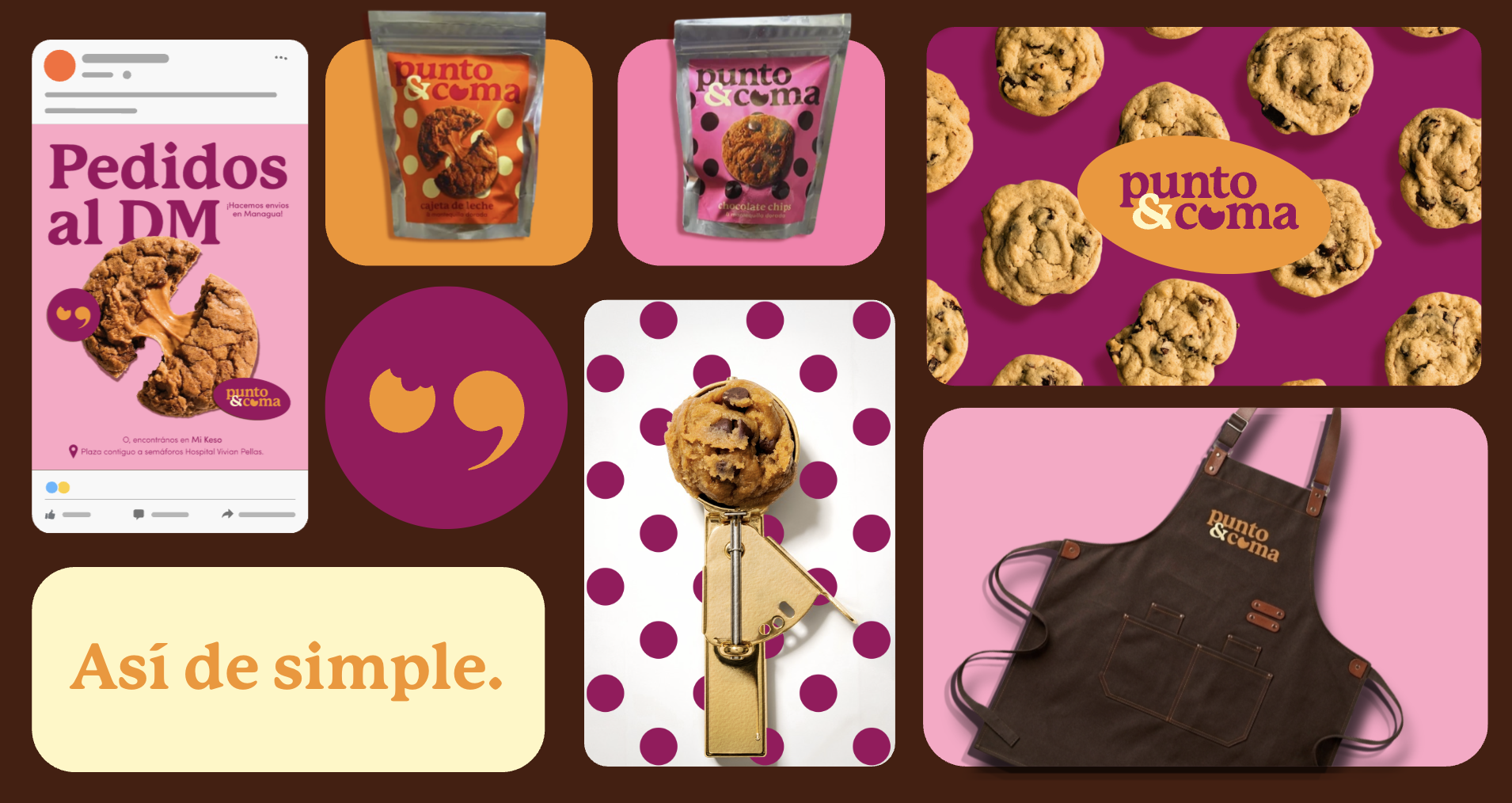
Brand board · Packaging, logo system and visual language
01 · The Brief
La vida necesita pausas.
Punto y Coma is a freelance project I am currently working on for a bakery brand. I developed the social media strategy and content calendar, defining content pillars, posting structure, visual direction, and messaging in collaboration with the brand designer. The project focuses on creating a clear and consistent brand presence across social media, with content designed to reflect the bakery's personality, products, and audience.
02 · Objectives
Appetite, clarity, conversion.
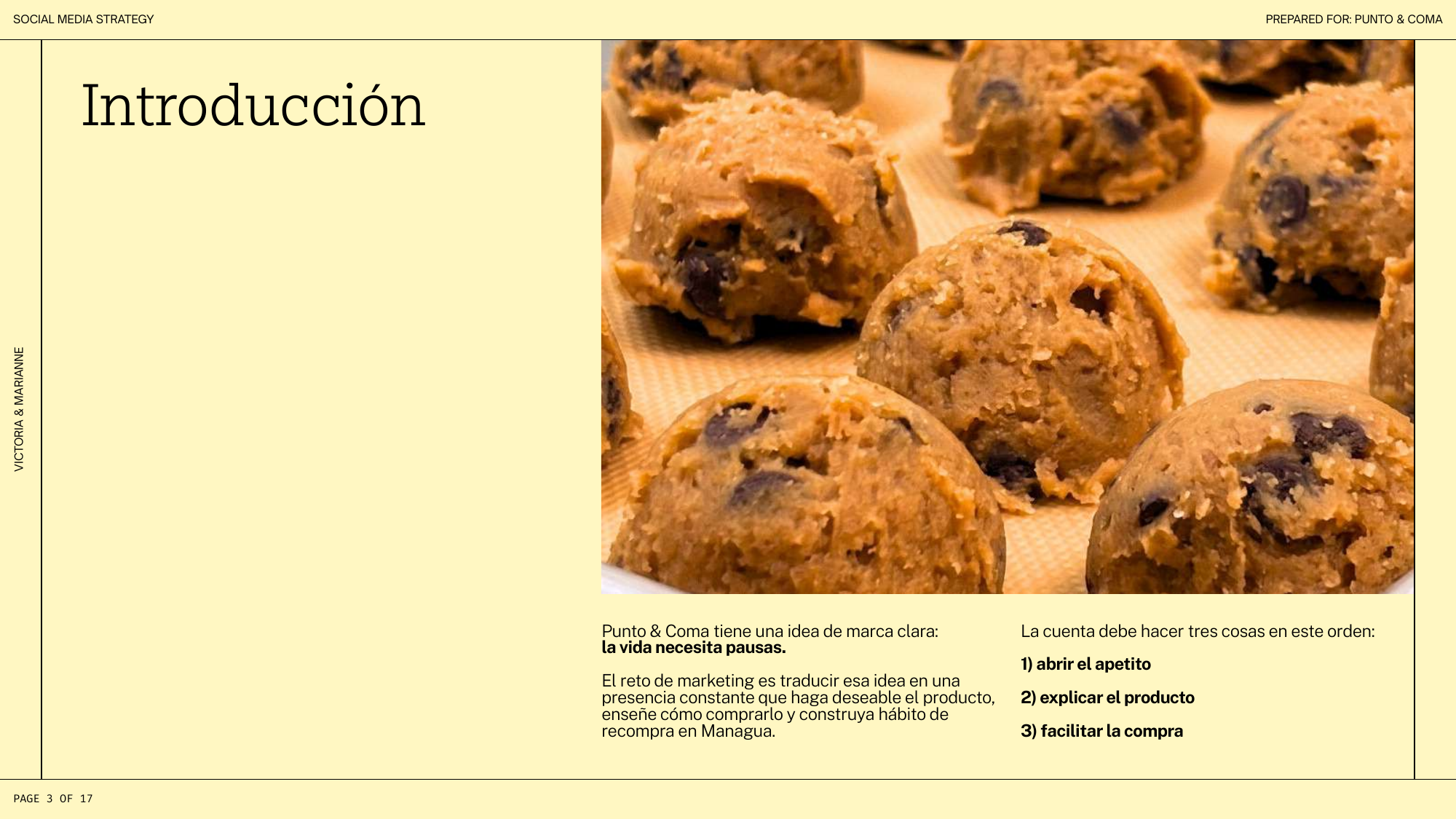
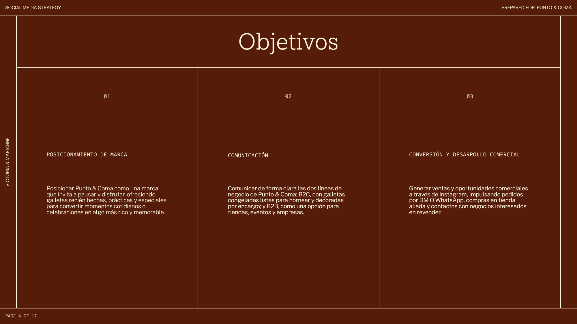
The account has to do three things in order: open the appetite, explain the product, and make buying effortless. That means positioning Punto & Coma as a brand that invites you to pause and enjoy, communicating its two business lines clearly — frozen ready-to-bake cookies and decorated orders for people, plus shops, events and companies — and converting Instagram into a real sales channel through DMs, WhatsApp orders and partner stores.
03 · The Strategy
A 17-page social media strategy.
The deliverable: a complete strategy deck covering objectives, brand voice, target audience, competitive landscape, Instagram strategy, content pillars, visual direction, action plan and metrics.
04 · Voice & Audience
Cercana, antojable, clara.
The brand voice is close, spontaneous and craveable — light humour, everyday language and clear, direct messages about product and purchase. Never corporate, never over-polished.
Two audiences drive the plan: young women in Managua who discover local brands on Instagram and want something delicious and effortless at home, and the owners of shops and cafés looking for a reliable, well-packaged sweet product to resell.
05 · Content Pillars
Five pillars, one feed.
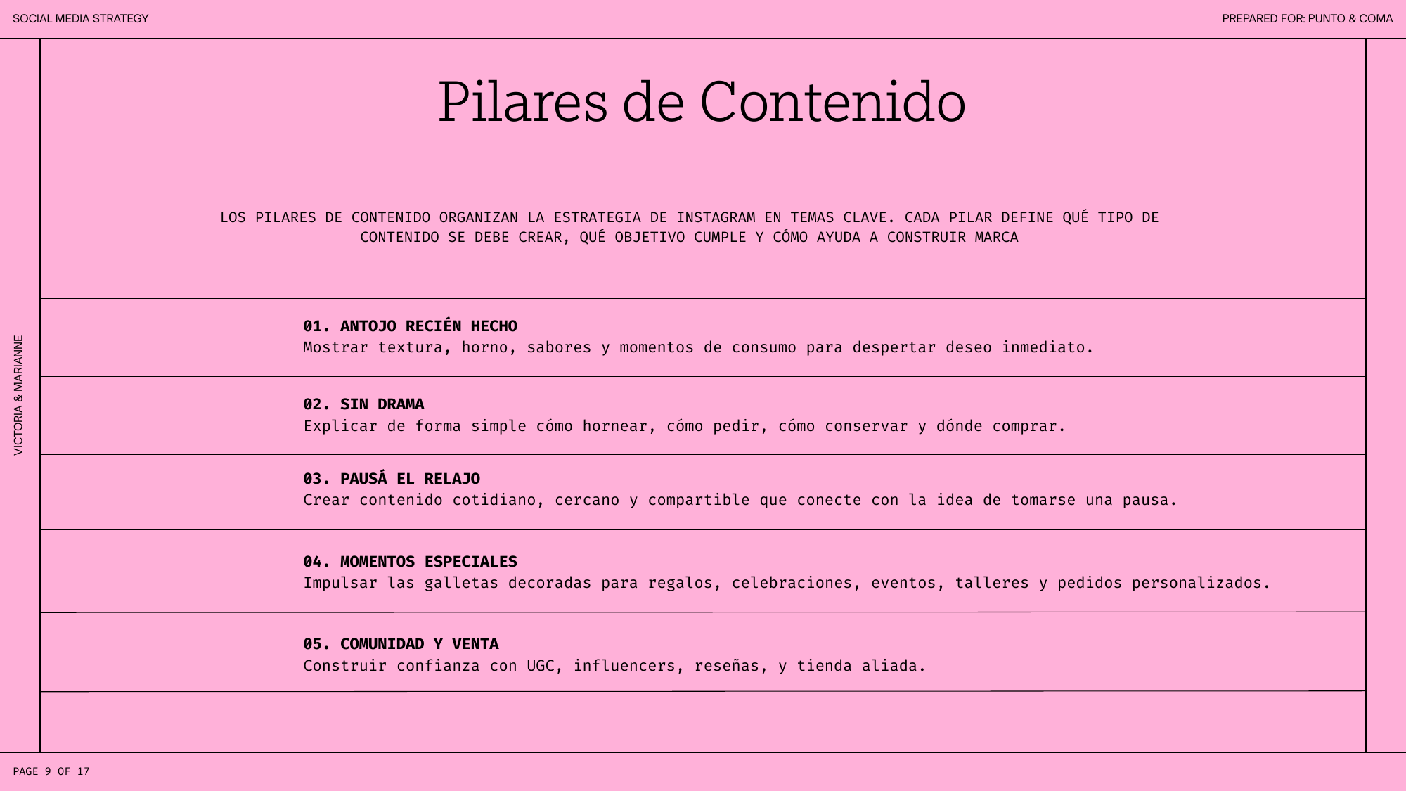
Each pillar defines what content to create, what objective it serves, and how it builds the brand.
01
Antojo Recién Hecho
Texture, oven, flavours and consumption moments — content designed to open the appetite.
02
Sin Drama
Simple, direct explainers: how to bake, how to order, how to store, where to buy.
03
Pausá el Relajo
Everyday, shareable content built around the brand's core idea: life needs pauses.
04
Momentos Especiales
Decorated cookies for gifts, celebrations, events and custom orders.
05
Comunidad y Venta
UGC, micro-influencers, reviews and partner stores — trust that converts into orders.
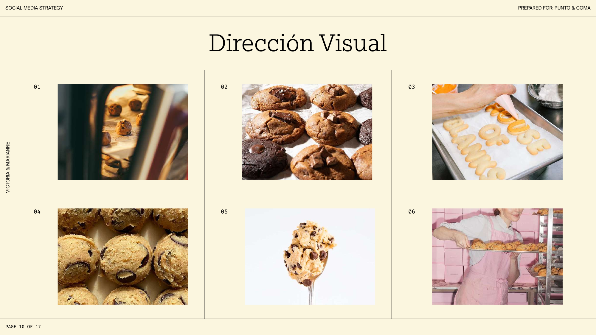
06 · Visual Direction
Bold, playful, unmistakable.
A visual system built with the brand designer — magenta and orange, polka dots and unapologetic product photography. The feed pairs real cookie texture with clean typographic layouts, so every post is recognisably Punto & Coma at a glance.
07 · Content Calendar
Consistency by design.
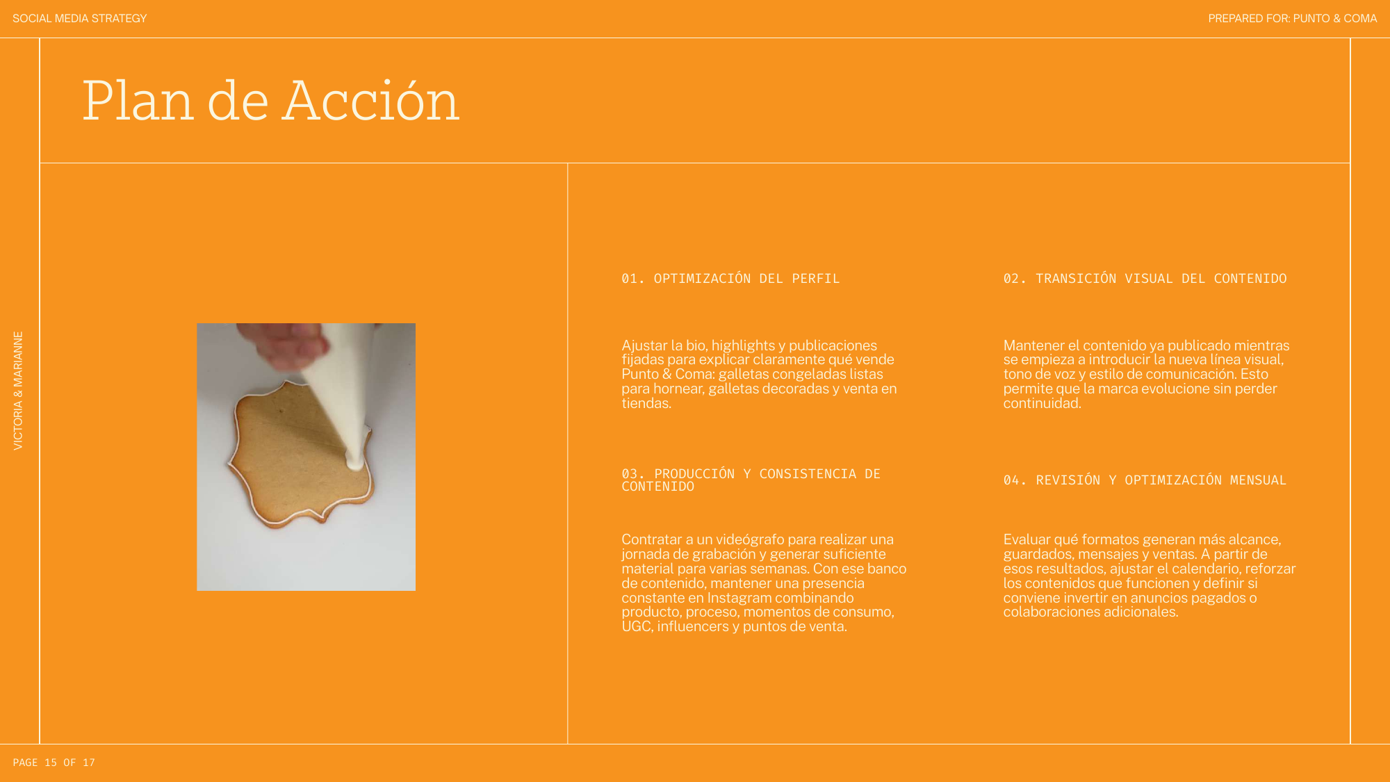
The posting structure is built around a content bank: a dedicated shoot day producing several weeks of material, mixing product, process, consumption moments, UGC and store features.
Every post carries a clear call to action — order by DM or visit a partner store — and performance is reviewed monthly to refine the calendar and decide where to invest next.
Brand identity by the brand designer · Strategy & content by Marianne Perez
08 · What I'm Learning
Strategy as an ongoing collaboration.
This project is ongoing, and that's what makes it different: instead of delivering a deck and moving on, the strategy lives and adjusts with every month of real content, real metrics and real conversations with the brand.
It has sharpened how I think about content systems — pillars, calendars and visual direction as one connected machine that makes a small brand feel consistent, alive and easy to buy from.
Next project — 09